
Refined Visualization
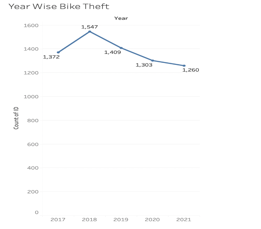
Line graph Visualization
We used the count of bikes stolen against each year to analyse which year saw the highest thefts. Line graph represents the data in a way that it can be interpreted in a user-friendly way and shows data accurately. This is a line graph which represents the number of bikes that were stolen from 2017 to 2021. 2018 showed the highest number of thefts and saw a decline from here on till 2021.
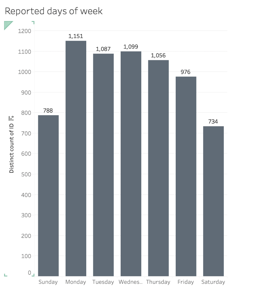
Bar Chart Visualization
Analyzed the number of thefts based on days the incident was reported, and the above bar chart illustrates that the most incidents occurred on mondays, while weekends were the least reported days. The data that has been visualized here is the count of cases reported on each day. The visualization illustrated maximum thefts occurring on Mondays and weekends see less number of thefts. From Friday onwards, the trend can be seen decreasing.
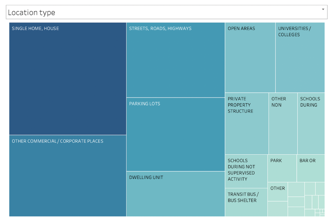
Location Heat Map Visualization
Data used here is the count of thefts that have occurred and have been reported in a particular public place. This has been represented using a heat map. It is surprising to know that the main target of thieves were the single home/house trailing by commercial places and highways. Public spots within closed boundaries have been less susceptible to thefts.
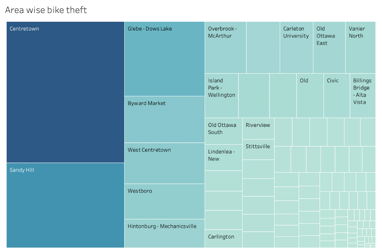
Area Heat Map Visualization
The data used here is of the number of bike thefts that have occurred and been reported in some areas of Ottawa. To represent the data accurately and in a visually interpretive way, we have used a heat map. Centretown experiences the most number of bike thefts and hence has been shown as dark blue box with a larger area for users to see clearly. The next two areas with most cases are Sandy Hill and glebe-dows Lake. Other areas represented in light blue colour are areas that are not very popular for thefts and see less cases reported.
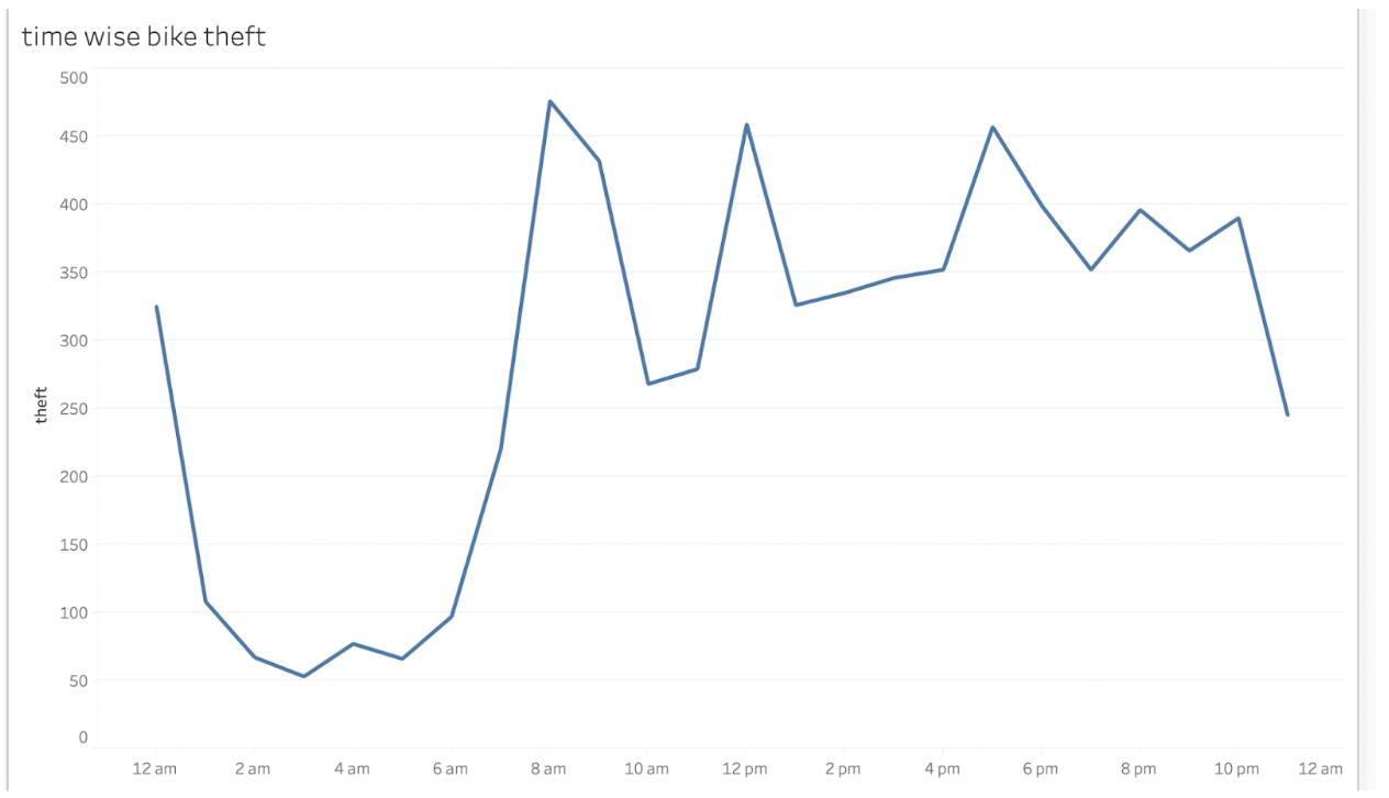
Line Graph Representations
This is a line graph that uses the data which tells us the time of the day when the theft happened. From the visualization we can infer that thefts suddenly shoot up between the time 6AM - 8AM making 8AM the peak time for thefts at about close to 475 thefts from the dataset. After 8AM, thefts have been irregular. At 10AM the count can be seen going down and then again increasing at 12 noon. There is an irregular pattern of increasing and decreasing thefts in intervals of every two hours. At night, after 12AM, thefts can be seen steeply decreasing till 1AM and then showing the least number of cases till 6AM. Thieves are probably sleeping.
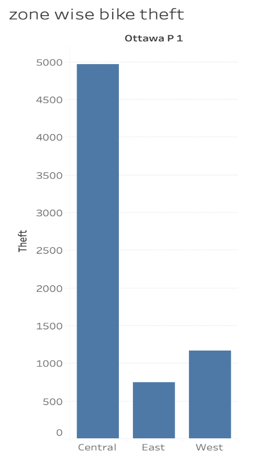
Bar Chart Representations
The data used here is the number of thefts within zones of the town. Bar chart has been used to represent this data as the data was linear. Areas in Ottawa have been divided into three major zones and this helps in understanding which zone sees the maximum theft cases. According to the visualization, the central zone is the most theft prone zone at about 500 thefts. East and West are marginally on the lower end almost at close to 80% less threats or more. East zone experiences the least cases .
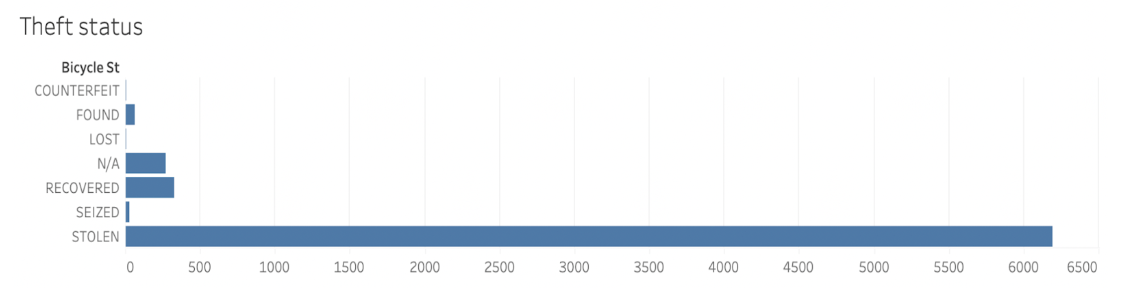
Bar Chart Representations
The data set contained the status of thefts for all the cases reported. The data has been represented with the help of a bar chart. All cases reported fell under the 7 categories - stolen, found, lost, seized, recovered, counterfeit or N/A. It can be easily interpreted from the above visualization that almost more than 95% cases of bike thefts that have been reported were stolen. Less than 10% were recovered. It can be understood that most bikes get stolen and cannot be found or recovered after being reported.