
Initial Sketches
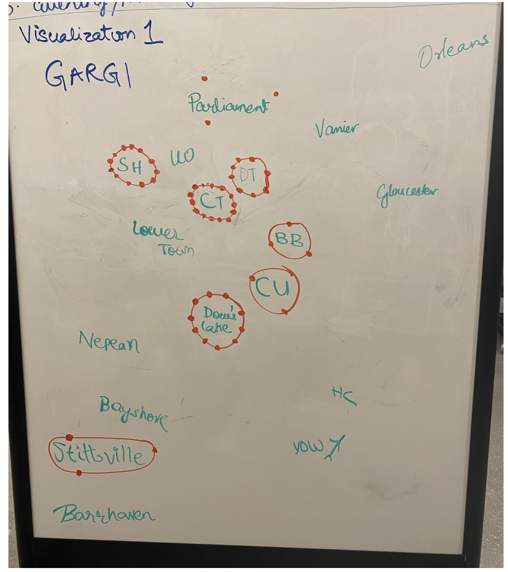
Heat Map Visualization
This is a heat map visualization of Ottawa. This representation was based on the idea that areas can be represented with high theft and low theft rate by encircling and putting dots along it to show higher rate. The areas with lower number of dots in the circle mean they have a low theft count. In this, Centre town, dows lake have a high rate while Stitsville and Carleton U can be seen having lower rates of thefts.
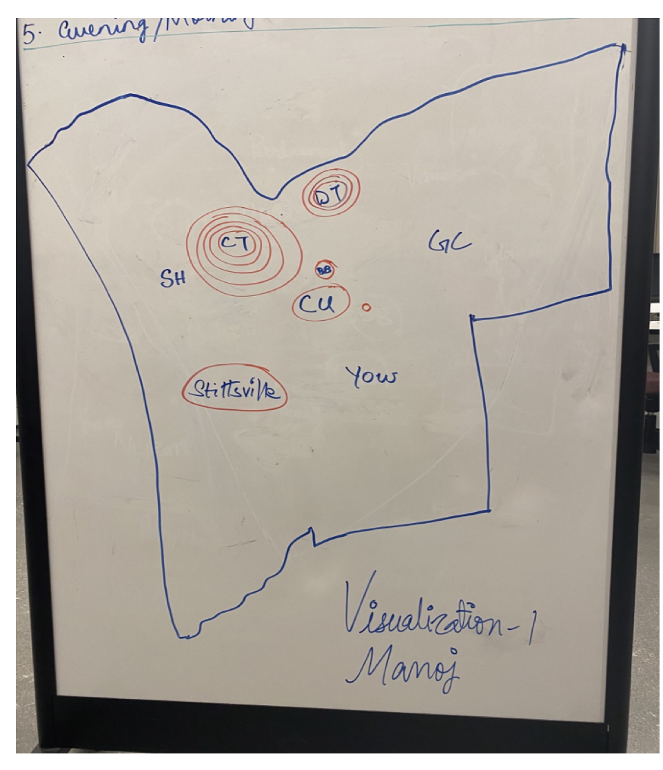
Heat Map Visualization
A Geographic heatmap with concentric circles will show which locations are theft prone and help in taking appropriate measures when people are planning to travel in those areas or planning to park their bikes in those locations.
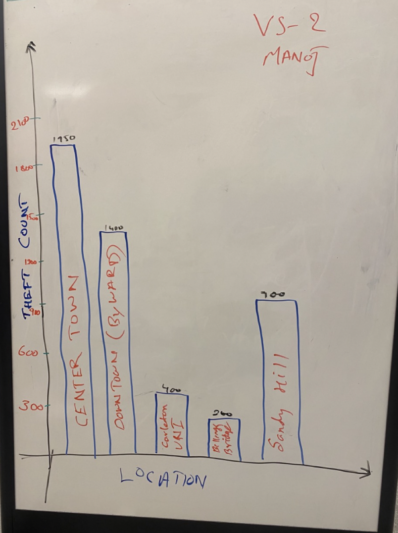
Bar Chart Visualization
The above visualization shows a bar graph of theft count in the city of Ottawa. It shows an area wise count of the thefts happening and to show the exact count, numbers will be displayed on top of each bar on the chart.
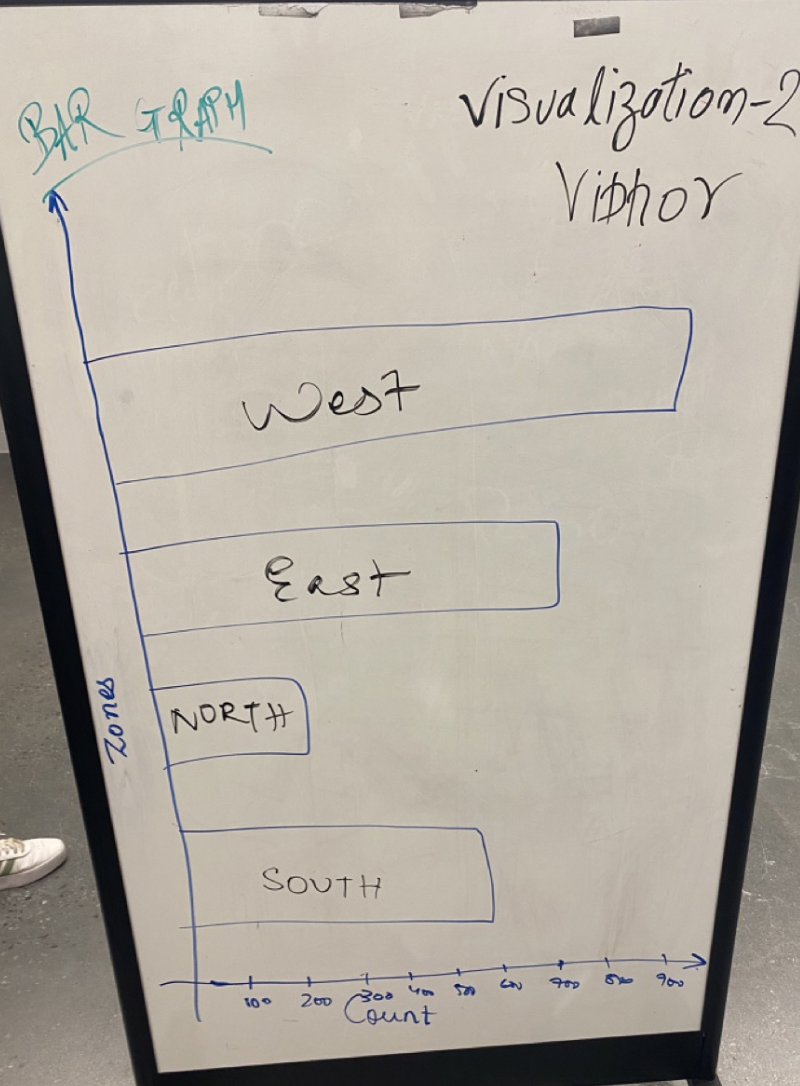
Bar Chart Visualization
This horizontal bar graph signifies the rate of theft as per the zones. This visualization can be used by the real estate agents or the potential property buyers about the crime rate of the area within the city.
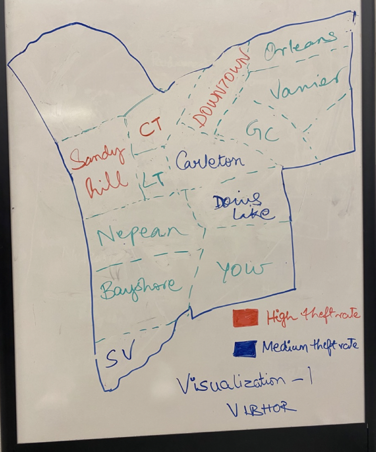
Graphical Representations
This Visualization signifies the demographics of the City of Ottawa. The color coding here is used to enhance more clarity over the visualization where the area mentioned in Red color is considered to be having high theft rate and the Blue color area defines the area where is comparatively less theft while the Green color have low theft rate .